In November 2025, we decided to rename 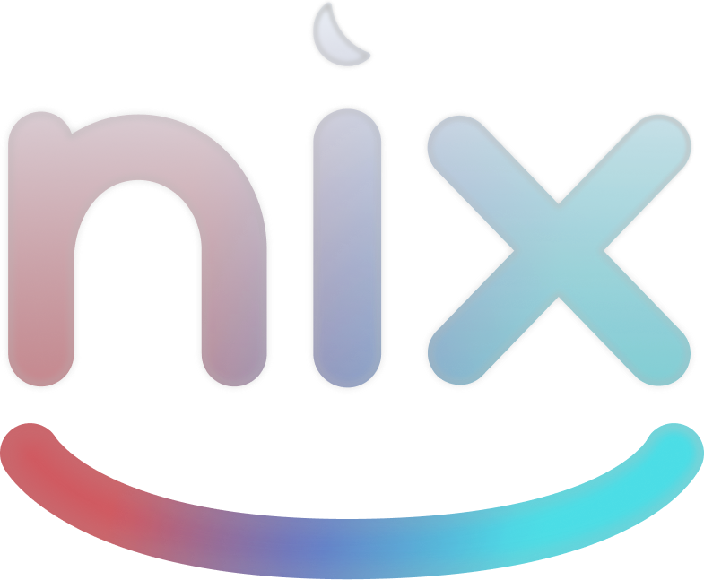 Nix Entertainment (called Nix Media at the time). Together with our name, we also wanted to renew our branding, and I was in charge of designing it.
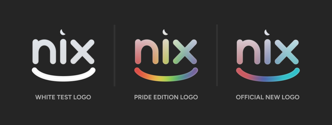
Our old logo used plain white text with just a flat gradient on the smile. It was "fine" as a logo, but we thought it was too dull and didn't reflect who we are as a media group.
Since we still wanted to keep the essence of our old branding, we decided to maintain the logo's shape, but restyle its appearance to represent our uniqueness and creativity.
In order to do this, I hand-made a custom glass shader that's applied to the entire logo, which allows the gradient in the "smile" area to bleed through the "nix" letters.

After adding our brand gradient to this new shader, the logo finally looked way more dynamic and interesting, just like we wanted.
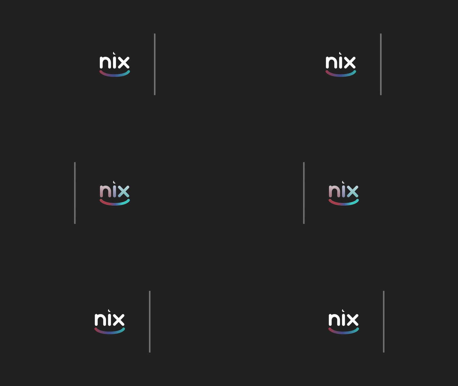
Besides the better visual look, it gives us a way to change the logo's colors dynamically and even add animations without having to create multiple versions of it. Here are some examples of the logo in different scenarios:
We also simplified our color palette and typography to go along with the new branding, and redesigned our website to reflect the new identity, which is available here.
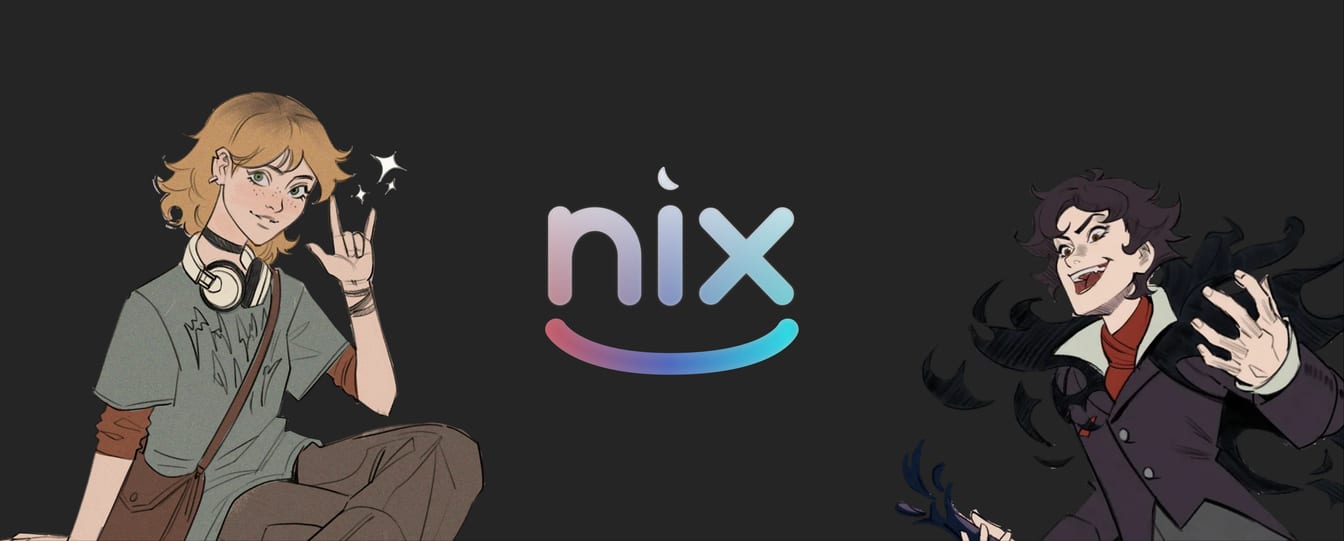
Finally, we redesigned our social media banner to match our new look, now including Umbriel and Aria, the main characters of our animated series Shadowborne Chronicles.
We're very happy with the new branding, and hope it will accompany us for many years to come!